Unveiling Male Power Underwear’s New Packaging: A Fresh Look
At Male Power, we understand that the way our products are presented is as crucial as the quality of the garments themselves. That’s why we’re thrilled to unveil our brand-new packaging, which combines style with functionality. This fresh look will debut with our latest collections and will gradually replace the packaging for our staple products.
Why the Change? To shed light on the inspiration behind this redesign, we spoke with CEO, Jeff Baker. Here’s what he had to say:
Q: What inspired the new packaging design?
A: Our goal was to create a fresh, modern, and upscale appearance that truly reflects the high quality of our products. We saw this as a prime opportunity to enhance our brand presence and ultimately boost sales for our retail partners.
Q: What are the standout features of the new packaging?
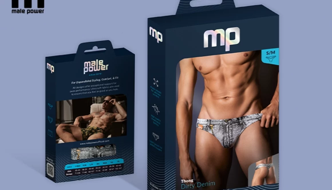
A: The new design features a sophisticated deep navy blue base color. We’ve simplified our logos for a more striking impact and incorporated icons on the side of the box to convey essential product information without lengthy descriptions. The addition of holographic foil introduces a bold, eye-catching detail, and a visible window showcases the actual garment inside.
Q: How does this new packaging improve upon the previous design?
A: The new packaging is designed to be more dramatic and visually appealing, drawing attention to the product itself. We’ve made strategic updates such as placing the back view of the garment on the front of the box, reducing the number of logos, and creating a cohesive design that ties all elements together.
Benefits for Retailers and Consumers For our retail partners, this new packaging is designed to be an effective selling tool. The cohesive design presents a unified, polished look while increasing the product’s appeal to consumers. The streamlined use of icons offers a sleek way to display information, and the prominent size chart makes it easier for shoppers to find their perfect fit.
Highlighting the Product Our revamped packaging is all about showcasing the product. By removing distracting elements, we’ve ensured that the garment takes center stage. The logo placement complements the product image, and the sizing information is now more visible than ever before.
We’re confident that this new packaging will not only attract more attention on the shelves but also reinforce the premium quality of our products. Stay tuned as we roll out this exciting update across our collections and experience the difference that thoughtful design can make.


